Tea Patterns

Typography and illustration meet geometric patterns

Over a cup of strong tea…

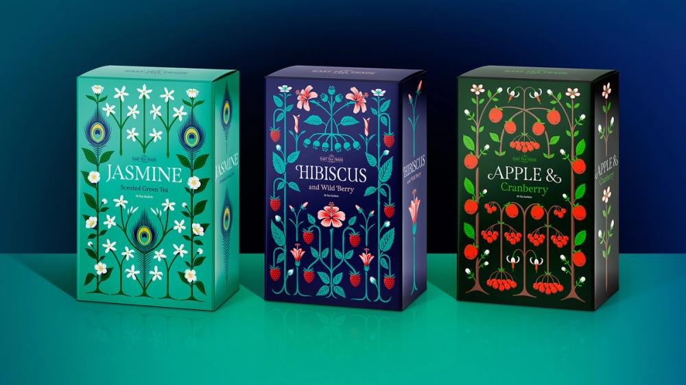
My lettering work naturally gravitates towards a more illustrative approach. I like to surround the text with related imagery or to enclose pictures within words. For this studio project, I chose to explore a design where lettering takes a backseat, allowing the illustrations to become the focus.

I read that tea drinking is in decline in England and, as someone fuelled by tea rather than coffee, I decided to show solidarity with my beverage of choice. I usually drink black tea, however, I discovered that the fruitier blends offered more scope for creativity than my usual English breakfast brews.

Tea Pattern Illustrations and Type Design featuring Span Font, Packaging | Design by Jamie Clarke Type
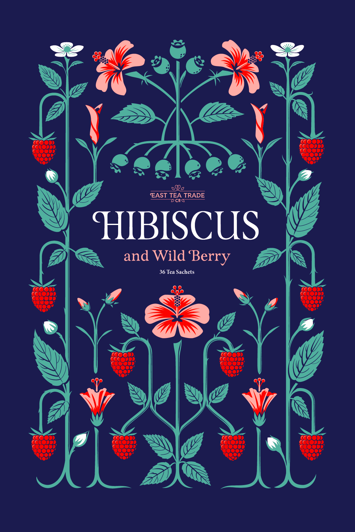
Tea Pattern Illustrations and Type Design featuring Span Font, Hibiscus | Design by Jamie Clarke Type

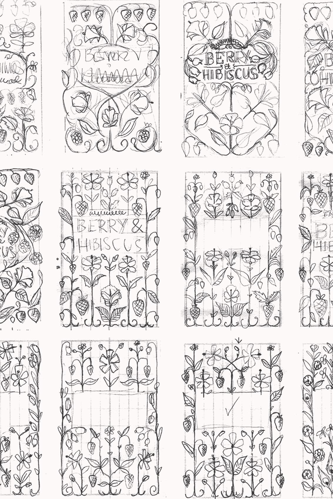
When combining illustrations with lettering, I like the imagery to adhere to a simple pattern, usually involving some symmetry. William Morris advised that “structure is a wall against vagueness” and with this in mind, I began by creating an underlying grid layout, over which to position the illustration. 

The principles that I normally apply to my type design— rhythm, uniformity, scale and clarity - all play their part. Indeed, most of the imagery for this packaging project was drawn using the same processes and tools as when I'm designing type. 

For the Hibiscus and Wild Berry option, my chosen layout allowed me to work four different stages of Hibiscus flower development into the design, from bud to fully open flower.

In my final design, I’ve sought to simplify shapes and to avoid the curls and swirls, or ‘over-abundant embellishments’ as described in Steven Heller’s article, Cult of the squiggly. The lettering follows the classic Roman style but with steep bracketed serifs to emphasise the vertical flow of the designs. 

The designs were featured on the excellent blog, TypographHer, in the article, Craftsmanship that would make William Morris proud.

The lettering I drew for the titles inspired my typeface Span which follows the heavy, glyphic serifs, high contrast, and engraved style of the letters.

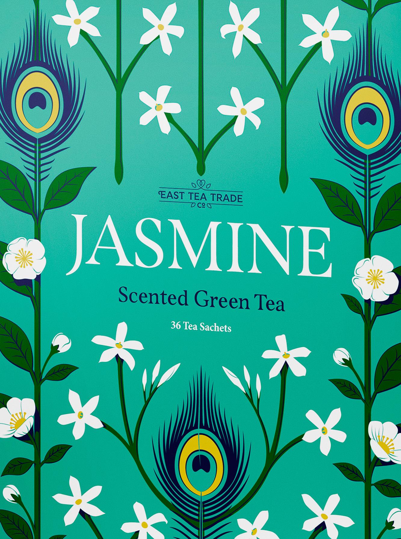
Tea Pattern Illustrations and Type Design featuring Span Font, Jasmine | Design by Jamie Clarke Type
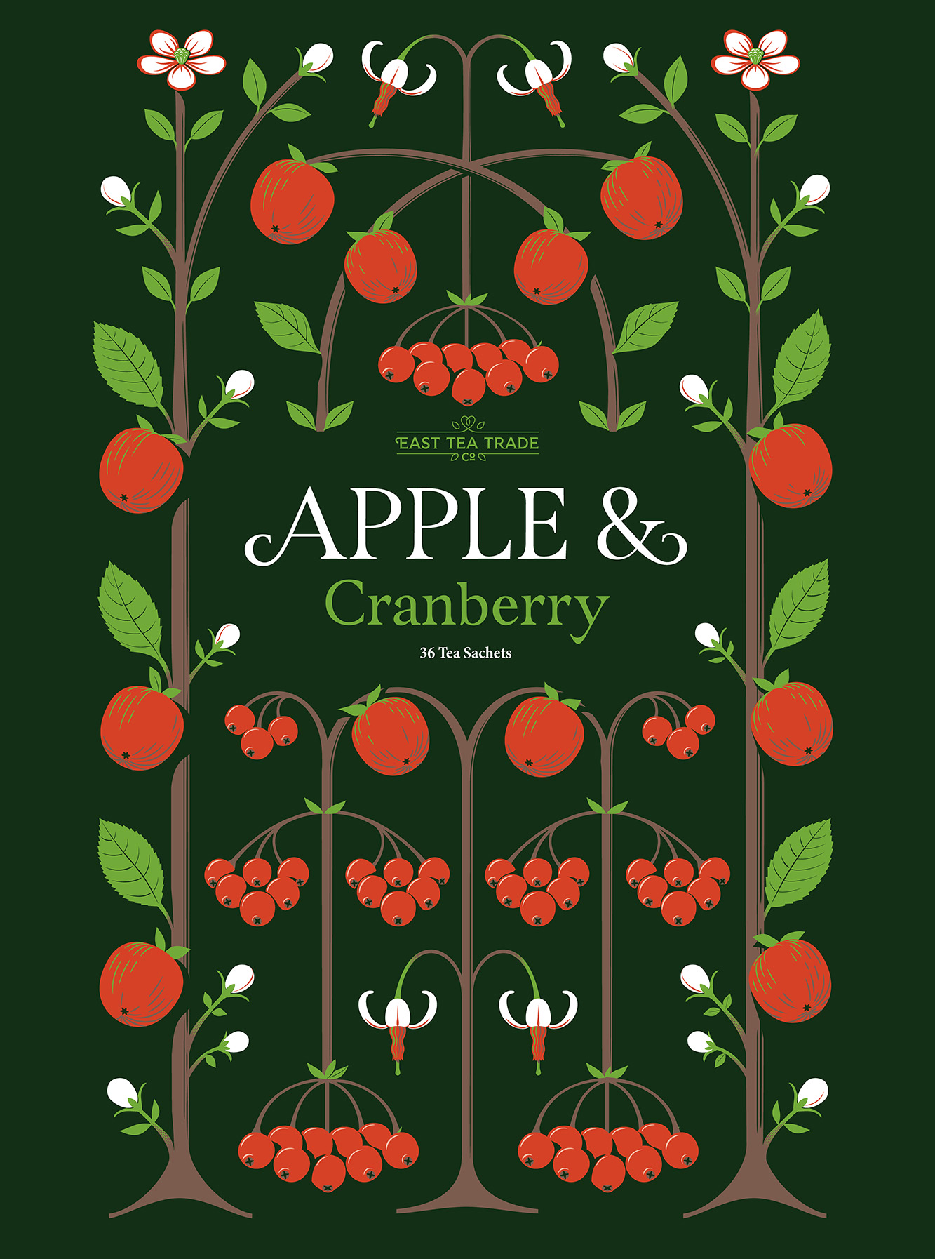
Tea Pattern Illustrations and Type Design featuring Span Font, Apple | Design by Jamie Clarke Type

This is the final design for the Apple & Cranberry option. The cranberry flowers have a beautifully distinct shape which worked well with the limited colour palette.

Tea Pattern Illustrations and Type Design featuring Span Font, Thumbnail sketches | Design by Jamie Clarke Type

Original thumbnail sketches exploring various compositions.

My original sketch for the Apple & Cranberry pattern. In the background, you can make out the underlying grid.

Tea Pattern Illustrations and Type Design featuring Span Font, Grid Design | Design by Jamie Clarke Type

Get my Fonts

Use my fonts free with an Adobe subscription or purchase from a reputable foundry partner.

Contact

I'd love to hear about your next project, and how I can help.

Newsletter

For occasional project and blog updates, please subscribe.

© 2015-2024 Jamie Clarke Type LTD and contributors | The Hive, Bristol, BS39 4JJ, United Kingdom